Gauja Sustainable Development Society – Brand Identity Design
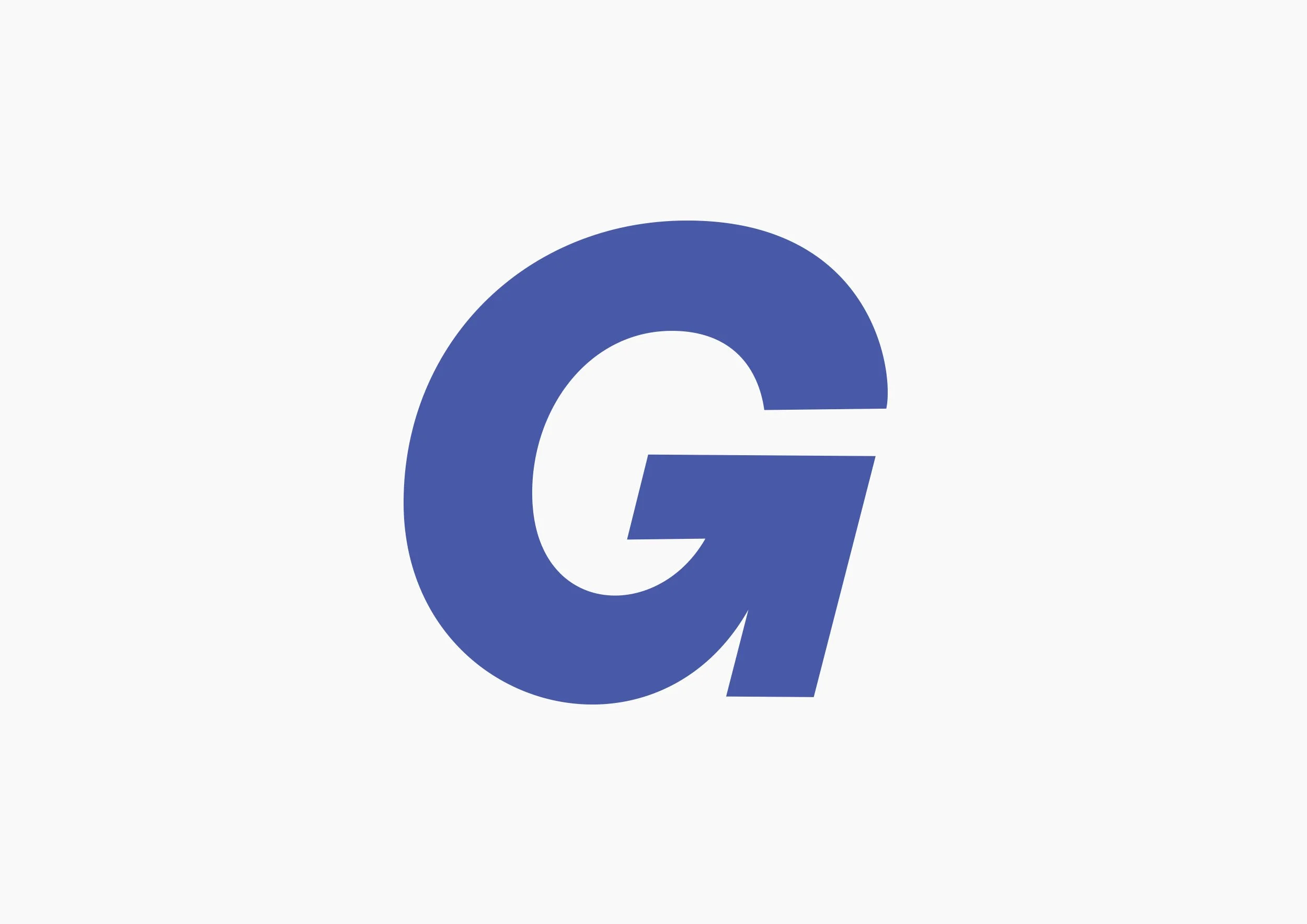
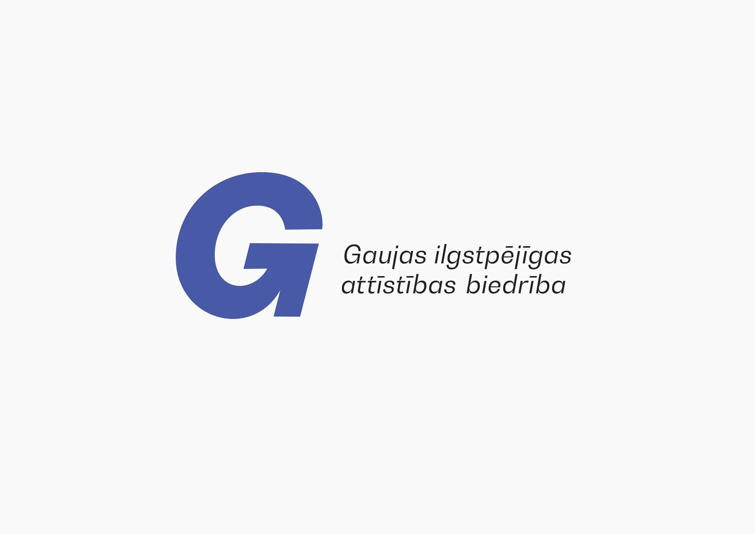
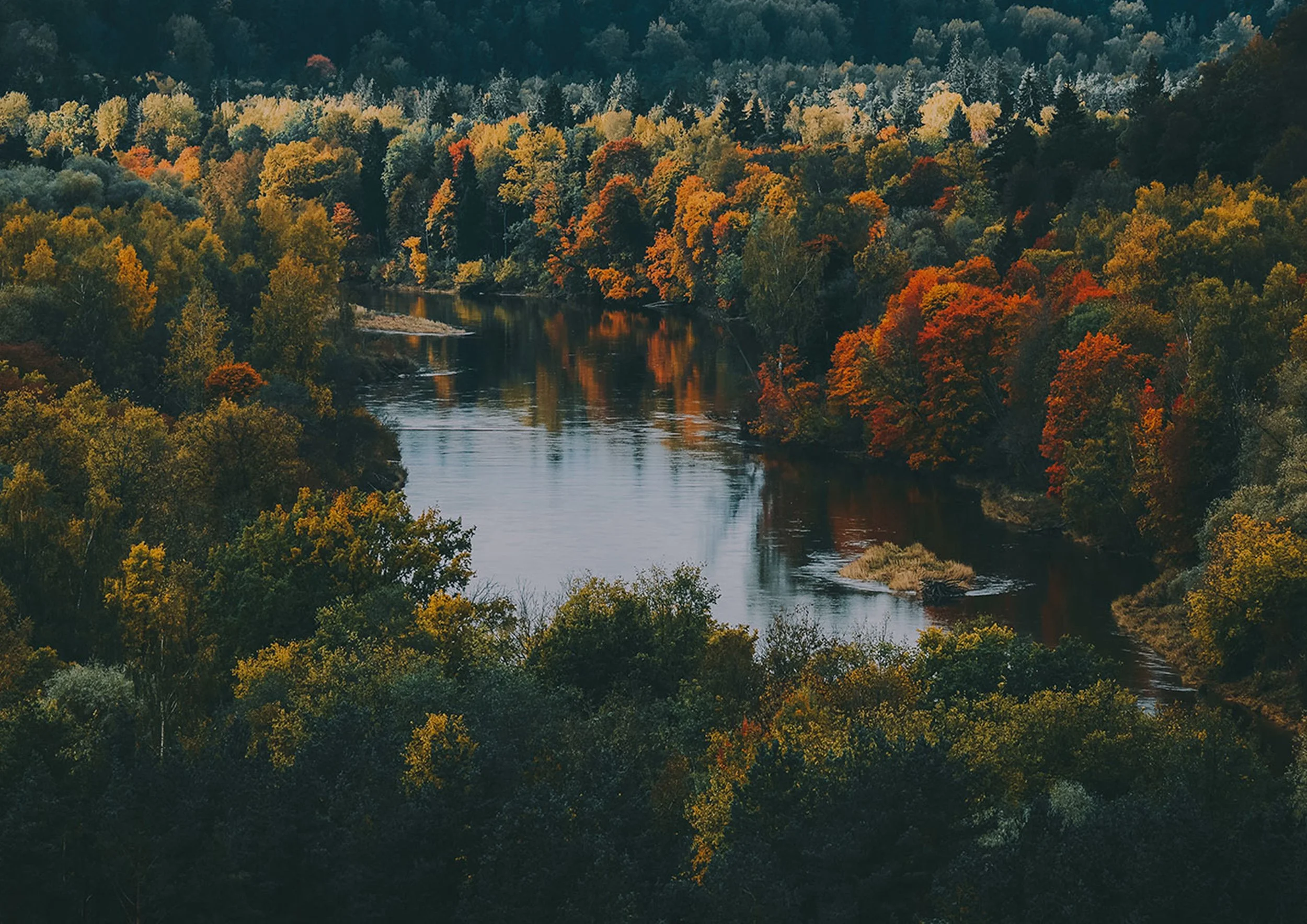
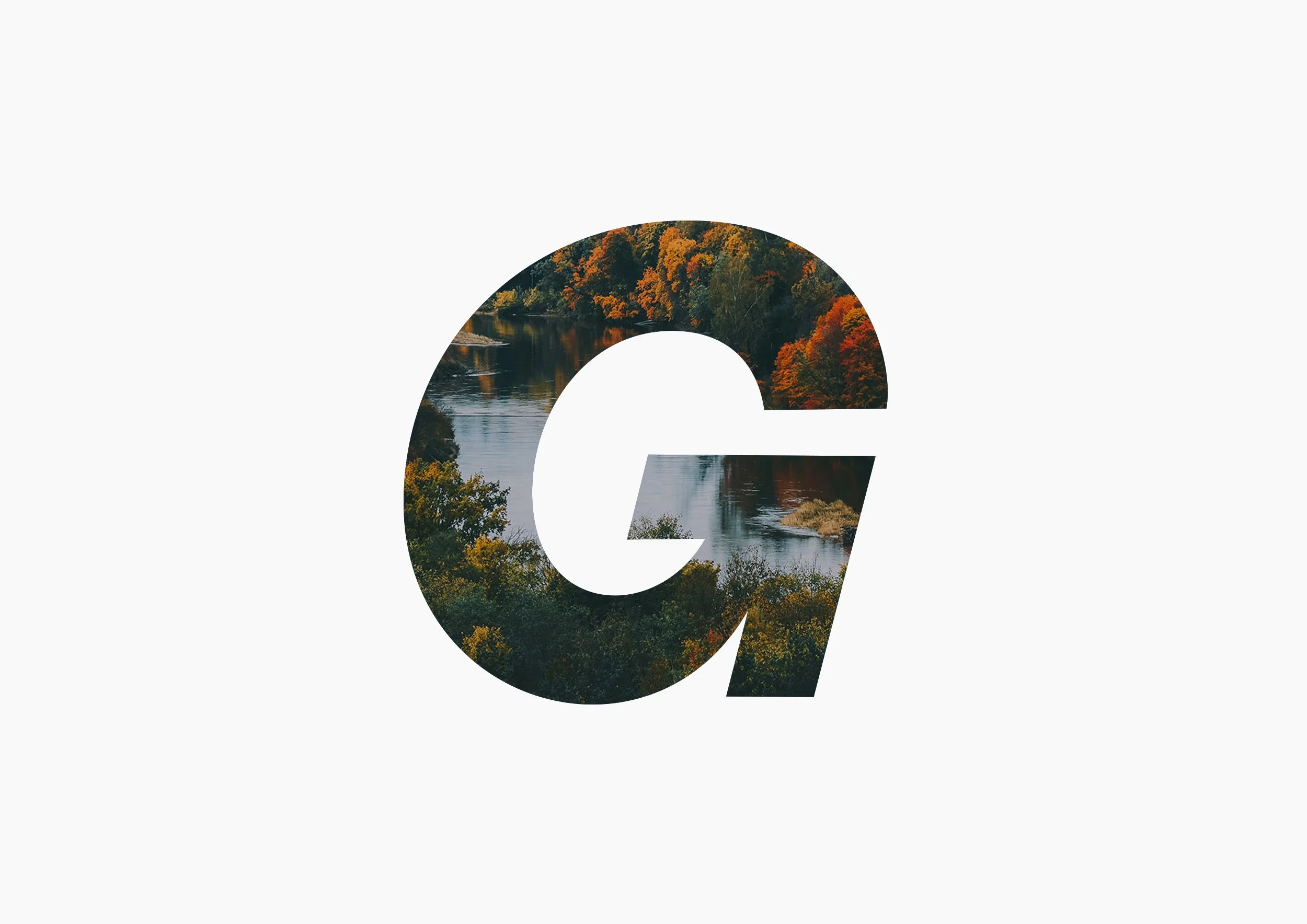
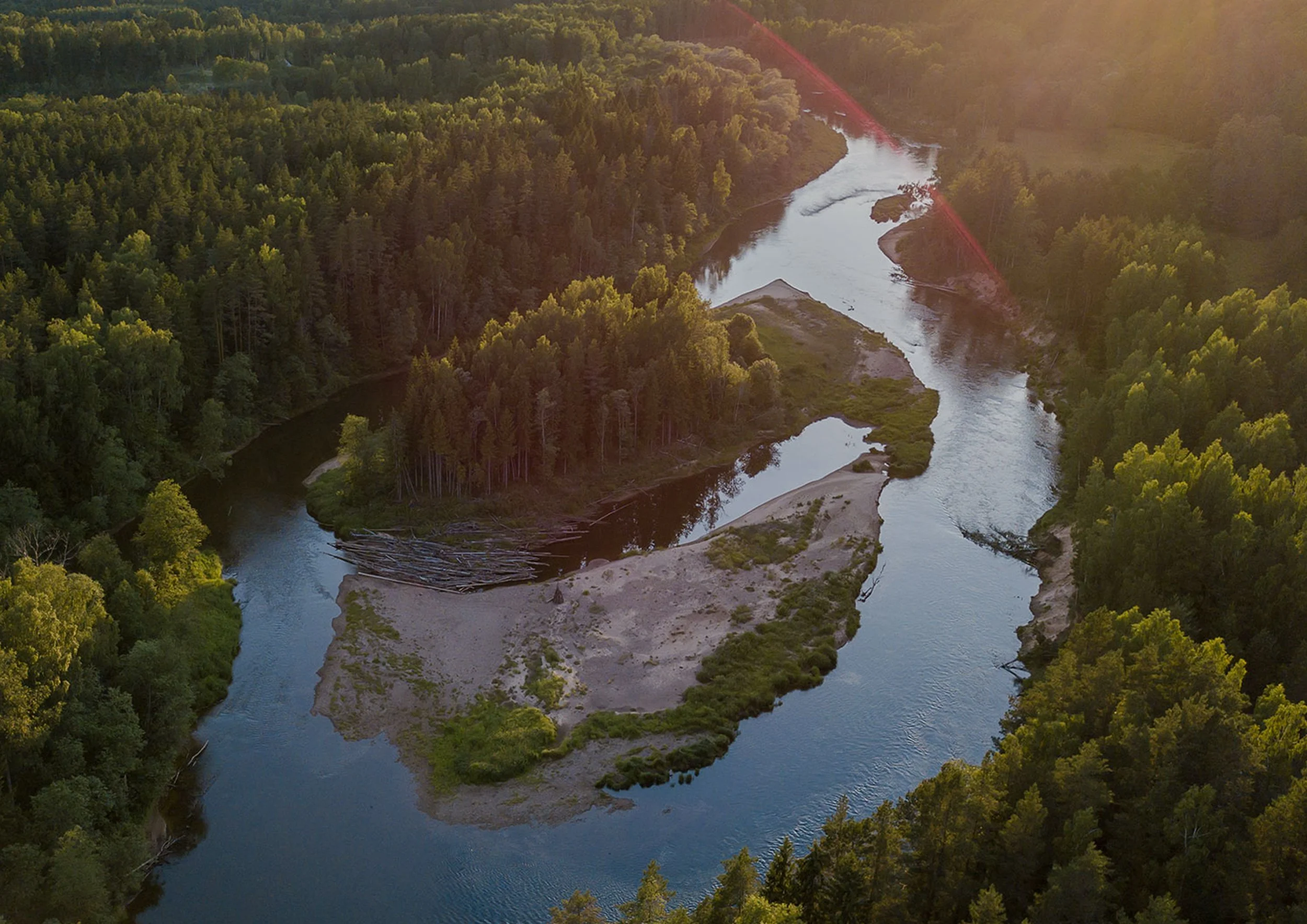
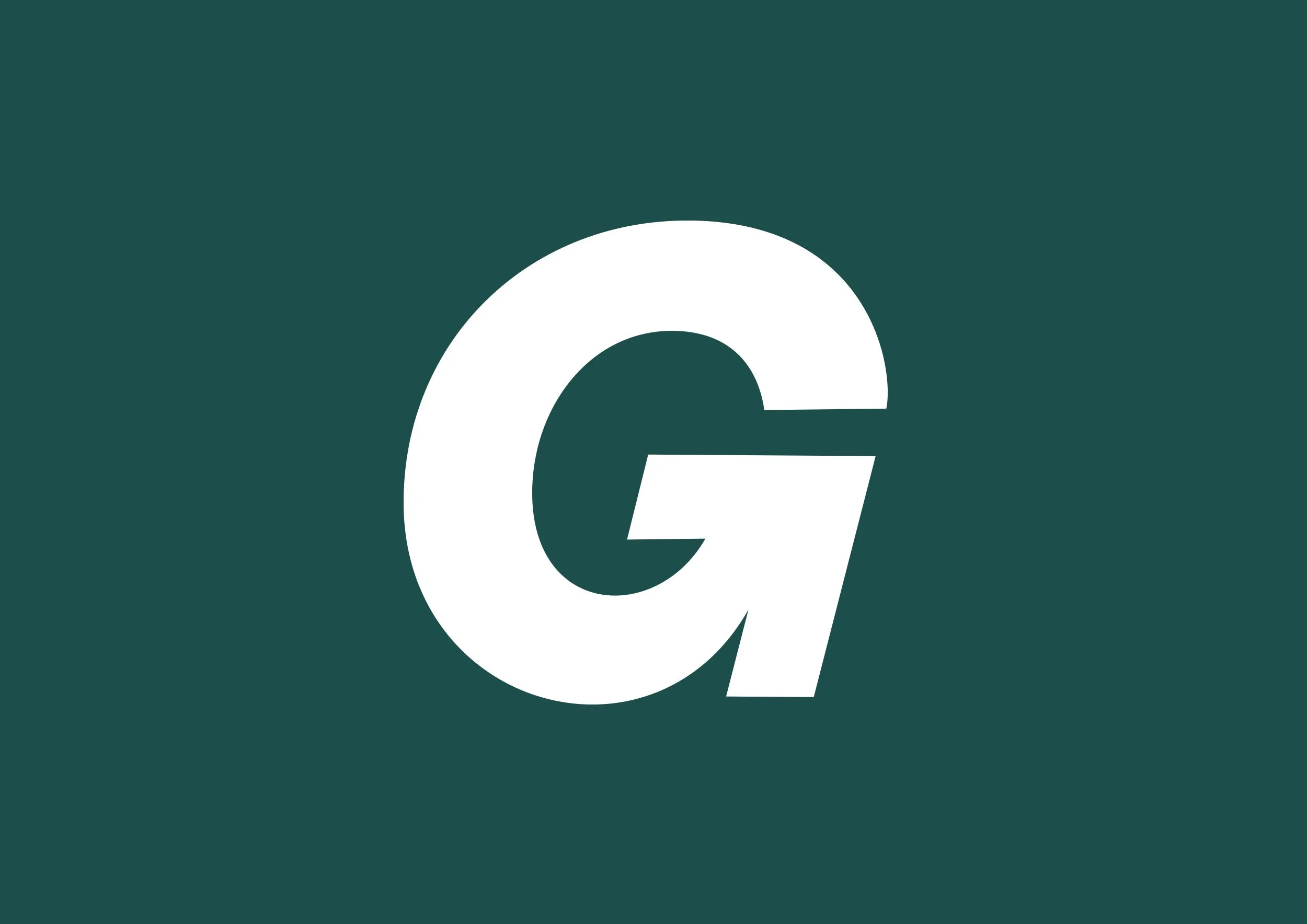
For the Gauja Sustainable Development Society, I designed the brand identity, including the main logo and color palette. The logo creatively combines the letter "G" (from the river name) with an upward arrow, symbolizing growth and sustainable development. The color scheme was carefully chosen to reflect the natural elements of the Gauja basin—blue for water, orange for sandstone, and green for the surrounding forests.
Gauja and its basin are widely regarded as the most beautiful river system in Latvia, and I’m proud to have contributed to a project that plays such a crucial role in preserving this natural heritage. The goal was to create an identity that conveys the organization’s mission while celebrating the beauty of the river and its environment.